
When it comes to creating a cohesive and inviting space, colour is everything. Whether you're choosing a new throw for your sofa, refreshing your cushions, or updating your walls, understanding the colour wheel can help you make design choices that feel intentional and balanced.
The Colour Wheel at a Glance

The colour wheel is a tool that shows the relationships between colours. It’s divided into three main groups:
- Primary colours: Red, yellow, blue.
- Secondary colours: Created by mixing two primary colours - green, orange and purple.
- Tertiary colours: The subtle hues that result from mixing primary and secondary shades.
Using the colour wheel, there are two main approaches to creating harmony: contrasting and tonal. Here’s how to work with each:
Opposites Attract: Contrasting Colours
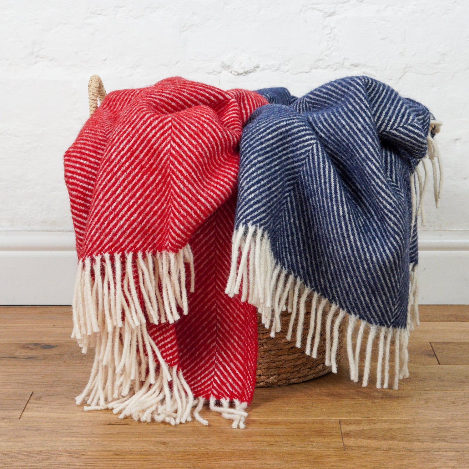
Contrasting colours, also known as complementary colours, sit directly opposite each other on the wheel. For example, blue and orange, red and green, or yellow and purple.
This approach brings energy and vibrancy to a space. Think of a deep blue wool throw paired with a warm orange cushion. The two colours balance each other out, creating a lively yet harmonious effect. Perfect for spaces where you want to add a pop of personality without it feeling overwhelming.
Pro Tip: When working with contrasts, choose one colour as the dominant shade and use its complement as an accent. This keeps the look bold but not chaotic.
Soft and Subtle: Tonal Colours
If you prefer a more understated style, tonal colours - those that sit next to each other on the wheel - are the way to go. These are also called analogous colours and include combinations like green and blue, or pink and peach.
Tonal pairings create a calming, cohesive feel that works beautifully in bedrooms or living spaces. For instance, layering a soft green blanket with pale blue cushions brings a sense of tranquillity to the room.
Pro Tip: To add depth to a tonal scheme, play with different textures. Pair a smooth wool throw with chunky knits or soft cotton cushions.
Choosing What Works for You
The beauty of using the colour wheel is that it gives you a clear starting point, but there’s no one-size-fits-all solution. Think about the mood you want to create in your space. Contrasting colours are ideal for energising and uplifting, while tonal combinations bring warmth and serenity.
In our Artisan Living collection, we’ve designed our pieces to work effortlessly within both approaches. Whether you’re drawn to bold contrasts or soft tonal pairings, you’ll find plenty of inspiration to complement your personal style.